Project Overview
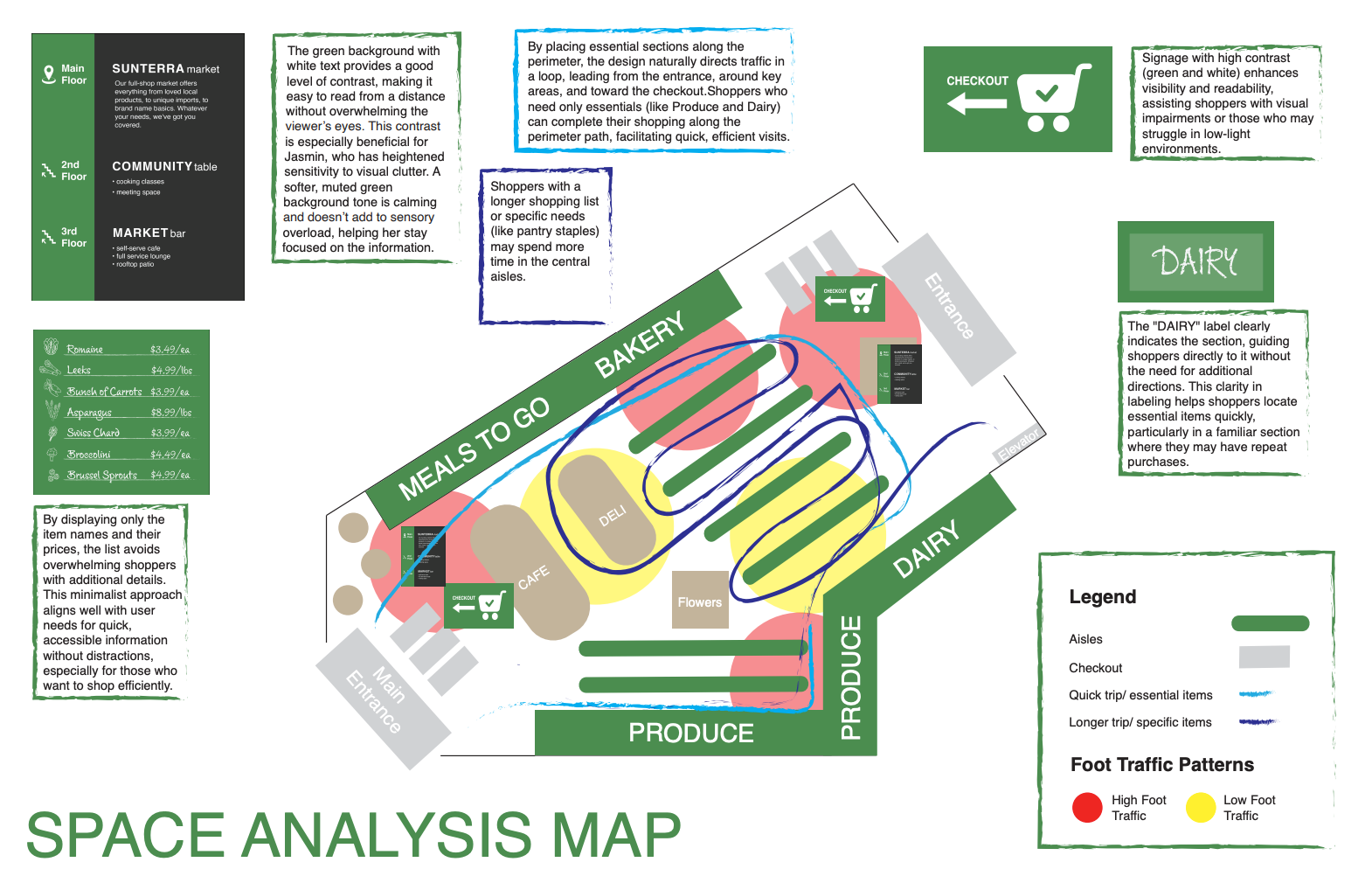
This project focused on designing a comprehensive wayfinding system for a local Sunterra Market. The goal was to improve navigational clarity and overall user flow by creating a cohesive set of directional signage, maps, and visual cues that guide users from entrance to exit with ease.
Design Brief
The brief required designing a signage system that was both functional and visually engaging. The space needed intuitive navigation to accommodate diverse users, including first-time visitors, elderly shoppers, and families, without overwhelming or cluttering the environment.
Target Audience
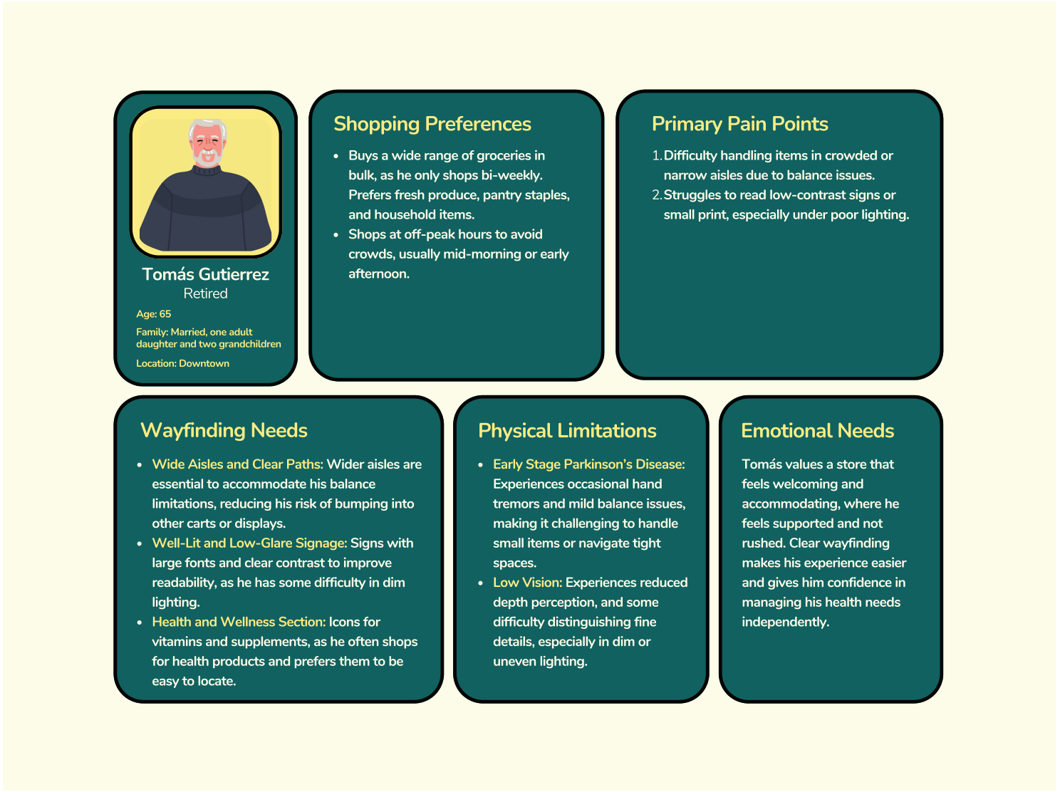
Shoppers and visitors of all ages and abilities navigating the market. Considerations were made for accessibility, visual clarity, and non-verbal communication to accommodate a multilingual or low-literacy audience.
Process & Methodology
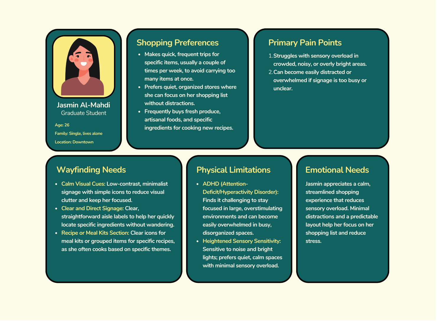
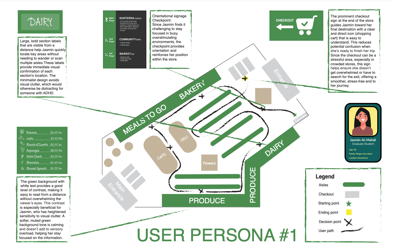
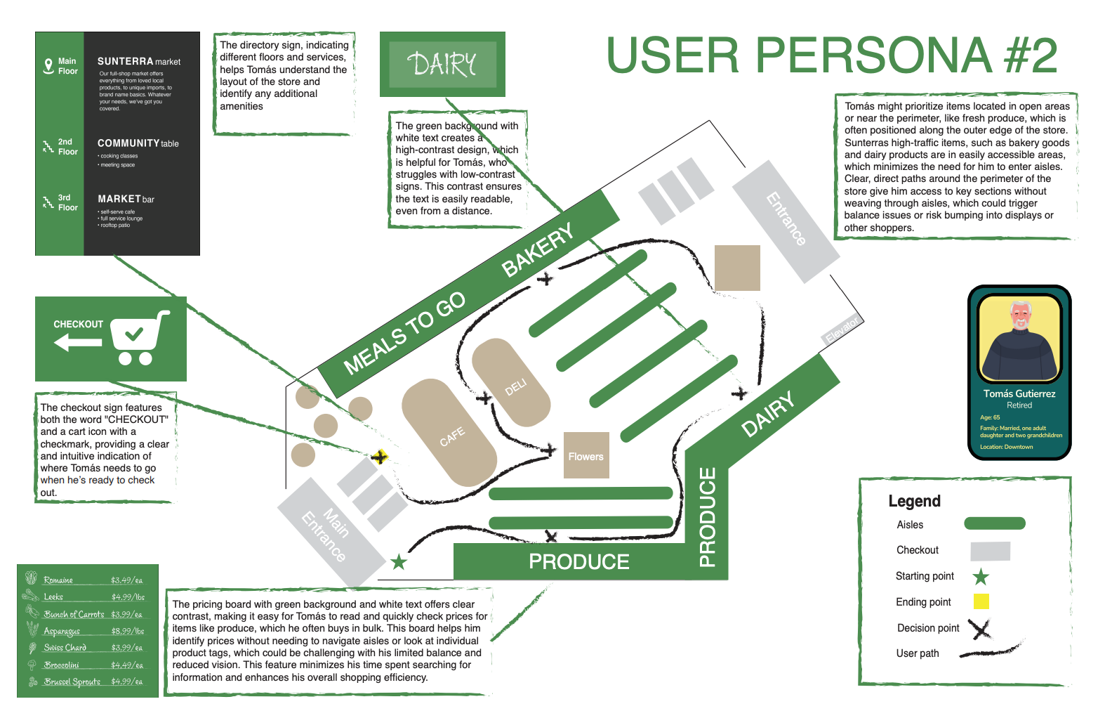
User Personas: Developed personas based on observational research and hypothesized user goals (e.g., the “frequent shopper” vs. the “first-time visitor”).
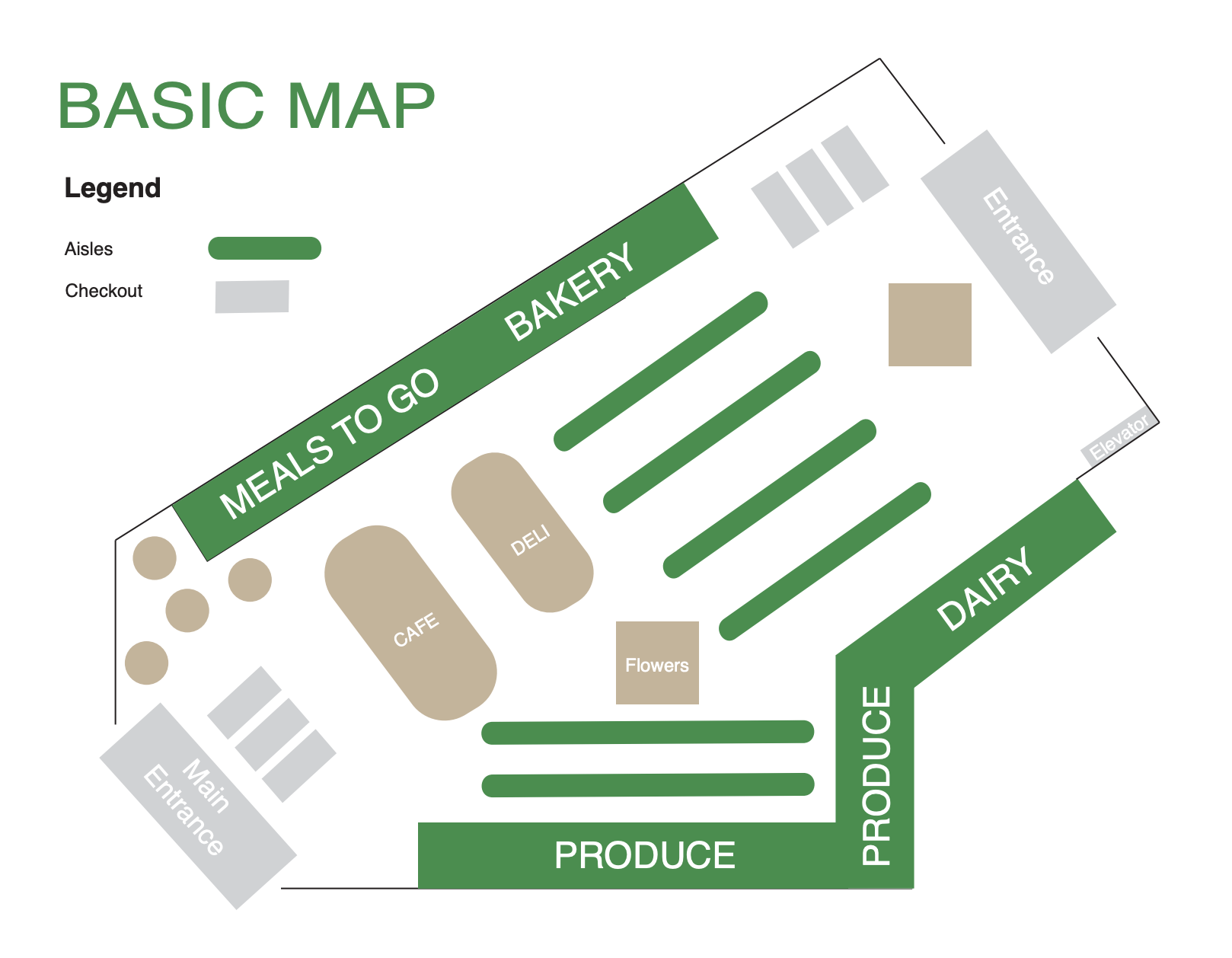
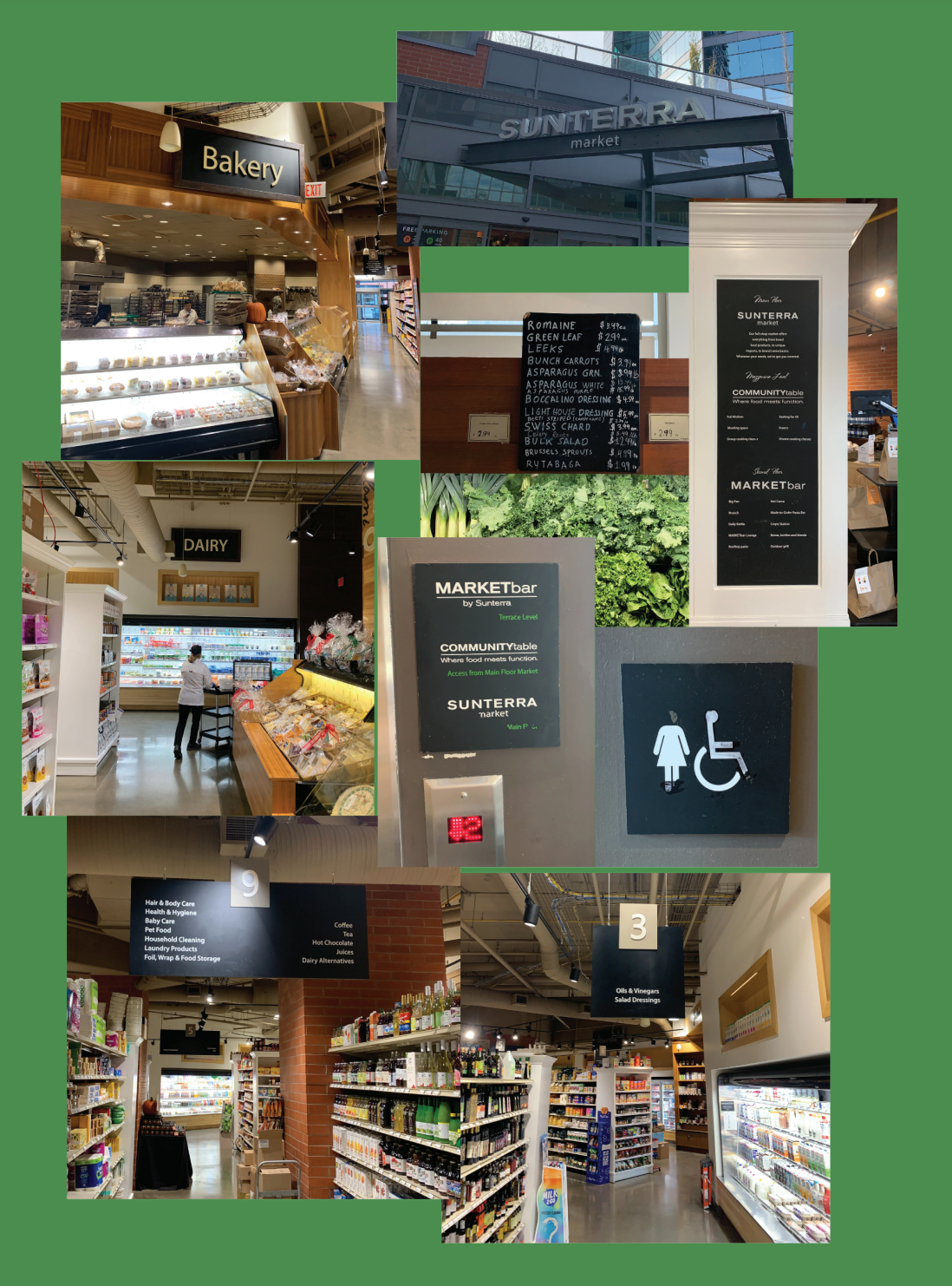
Environmental Analysis: Mapped user journeys and common friction points in physical space using basic pathfinding principles.
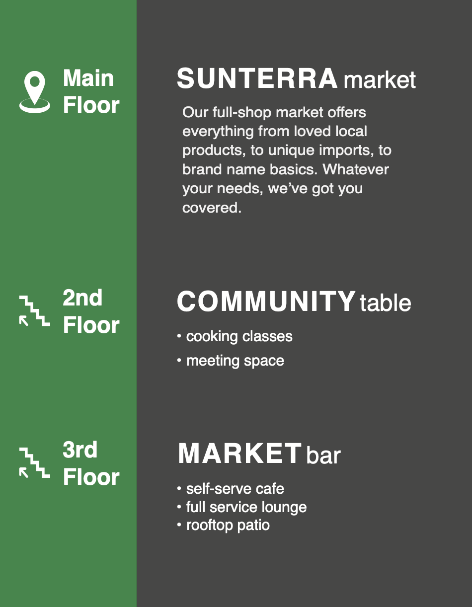
Visual Language System: Designed a consistent icon set, color-coding system, and typographic hierarchy to ensure legibility and quick recognition.
Prototyping & Testing: Created scaled mockups of key signage (entry map, aisle markers, directional signs) and evaluated placement and visibility within a simulated layout.


Reflection
This project strengthened my ability to think spatially and design for real-world interaction beyond the screen. It deepened my appreciation for visual systems, user flow, and the subtle ways design influences movement. If implemented in a live environment, I would conduct observational usability testing to assess wayfinding efficiency and user comprehension in context.