Role: Information Designer (UX-focused)
Focus: Accessibility, usability testing, public-facing systems
Tools: Figma, Adobe Creative Suite
This project applies WCAG-informed design and structured information principles to ensure reports are understandable, actionable, and effectively support public service response.
Challenge
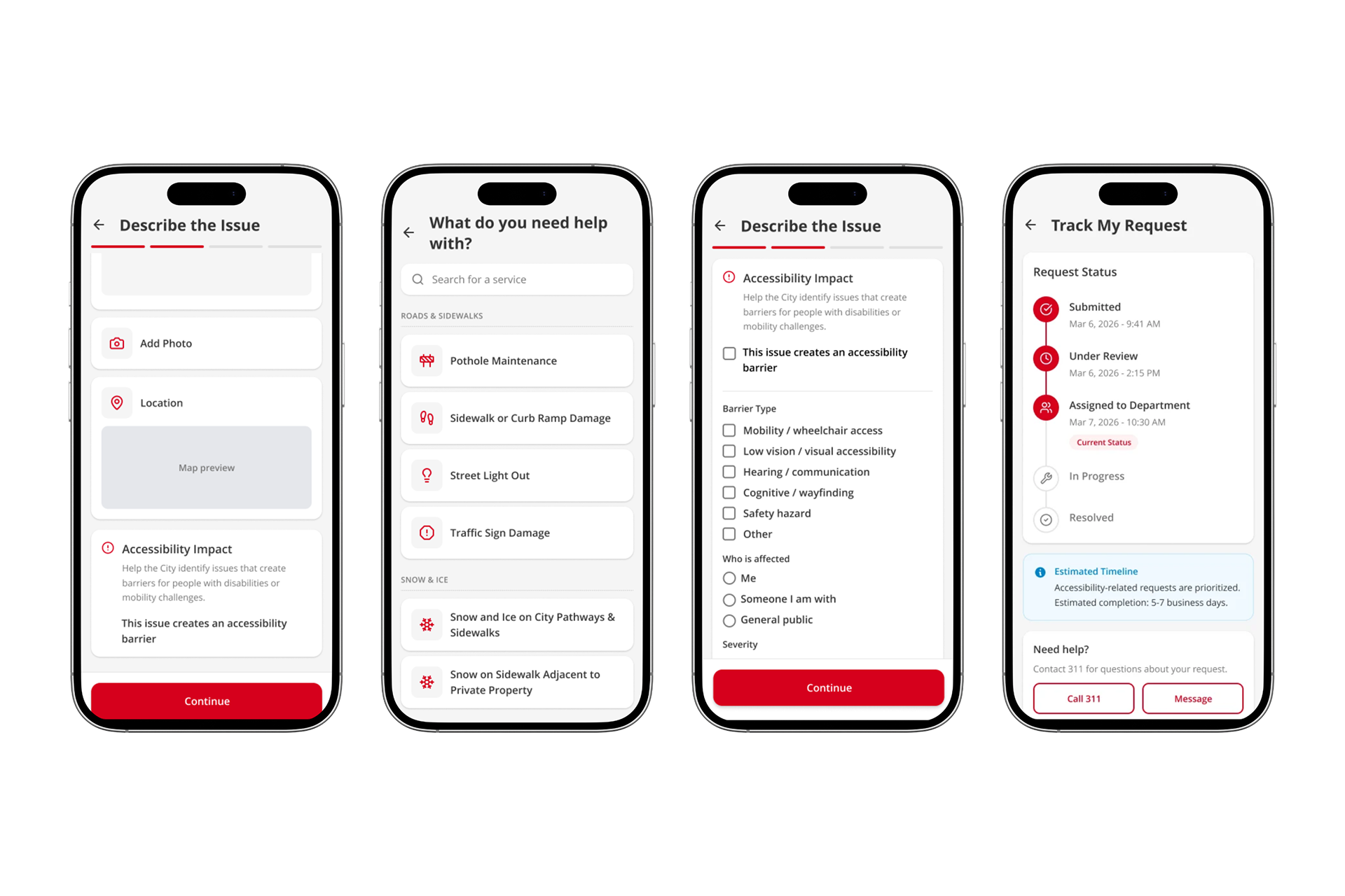
The 311 reporting flow relies heavily on open-text input and unclear visual cues, resulting in incomplete or misclassified submissions. Accessibility-related concerns were often submitted under general categories, making them difficult to identify and respond to effectively.
Research combined SME interviews, comparative analysis, and submission audits to identify breakdowns in how information was categorized and communicated.
Three findings identified where information breakdowns were occurring in the reporting process:
Unstructured input led to incomplete and inconsistent reports:
Introducing structured fields ensures critical information is consistently captured and easier to act on. SME interviews and an accessibility audit revealed that open-text entries often missed key details, making reports difficult to interpret and inconsistent across submissions.
Introducing structured fields ensures critical information is consistently captured and easier to act on. SME interviews and an accessibility audit revealed that open-text entries often missed key details, making reports difficult to interpret and inconsistent across submissions.
Delayed categorization increased user error
Introducing an early accessibility flag reduced decision friction and improved classification accuracy. Comparative analysis of similar reporting systems showed that requiring users to categorize issues late in the flow increased cognitive load and led to incorrect classifications.
Providing a clear status timeline improved transparency and user confidence. The absence of general timeline information and status tracking led to uncertainty about whether submissions were successfully addressed.
Usability Testing
Two rounds of usability testing with 8 participants using a think-aloud protocol evaluated how visual communication and information hierarchy influenced user understanding and decision-making.
Visual misinterpretation of system feedback
Participants consistently interpreted confirmation messages as errors due to red warning styling. This created uncertainty about whether submissions were successful. Replacing the red state with a neutral, informational design reduced misinterpretation and reinforced successful submission.
Participants consistently interpreted confirmation messages as errors due to red warning styling. This created uncertainty about whether submissions were successful. Replacing the red state with a neutral, informational design reduced misinterpretation and reinforced successful submission.
Hierarchy influenced user actions post-submission
When presented with multiple options, participants prioritized tracking their request over submitting another report. However, the interface emphasized “Submit Another Request,” creating a mismatch with user intent. Adjusting the button hierarchy aligned the interface with expected user behaviour and improved flow.
When presented with multiple options, participants prioritized tracking their request over submitting another report. However, the interface emphasized “Submit Another Request,” creating a mismatch with user intent. Adjusting the button hierarchy aligned the interface with expected user behaviour and improved flow.
The redesigned reporting flow improves how accessibility issues are structured and communicated, resulting in clearer, more actionable submissions for both users and internal teams.